Overview
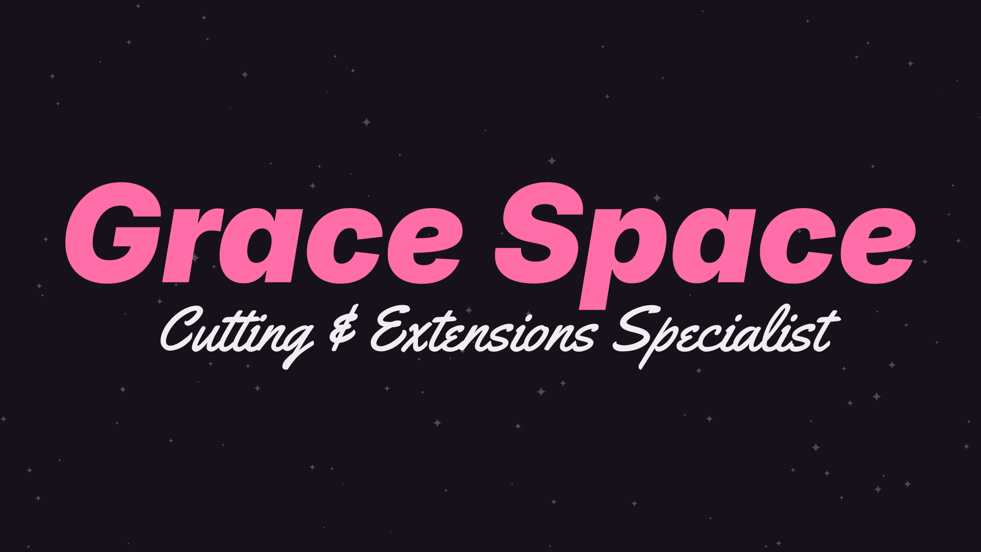
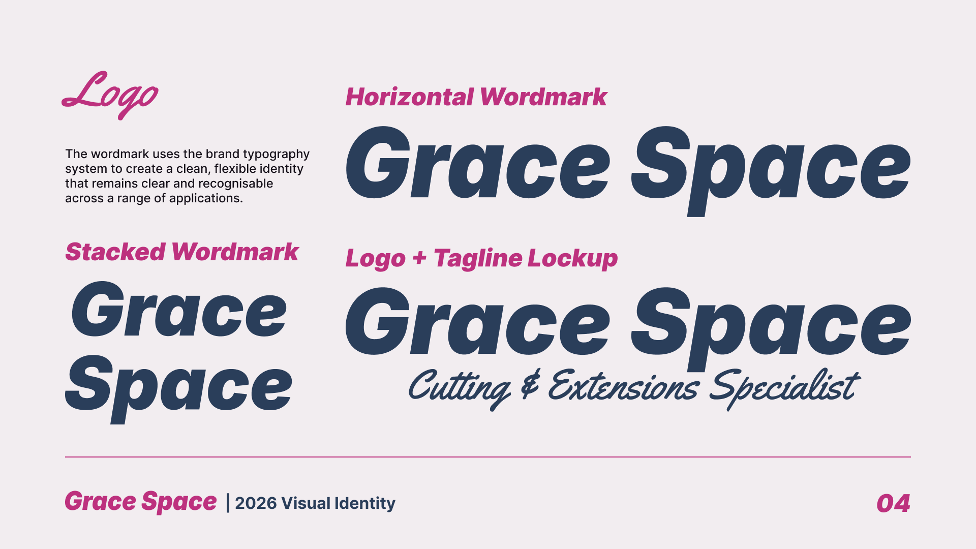
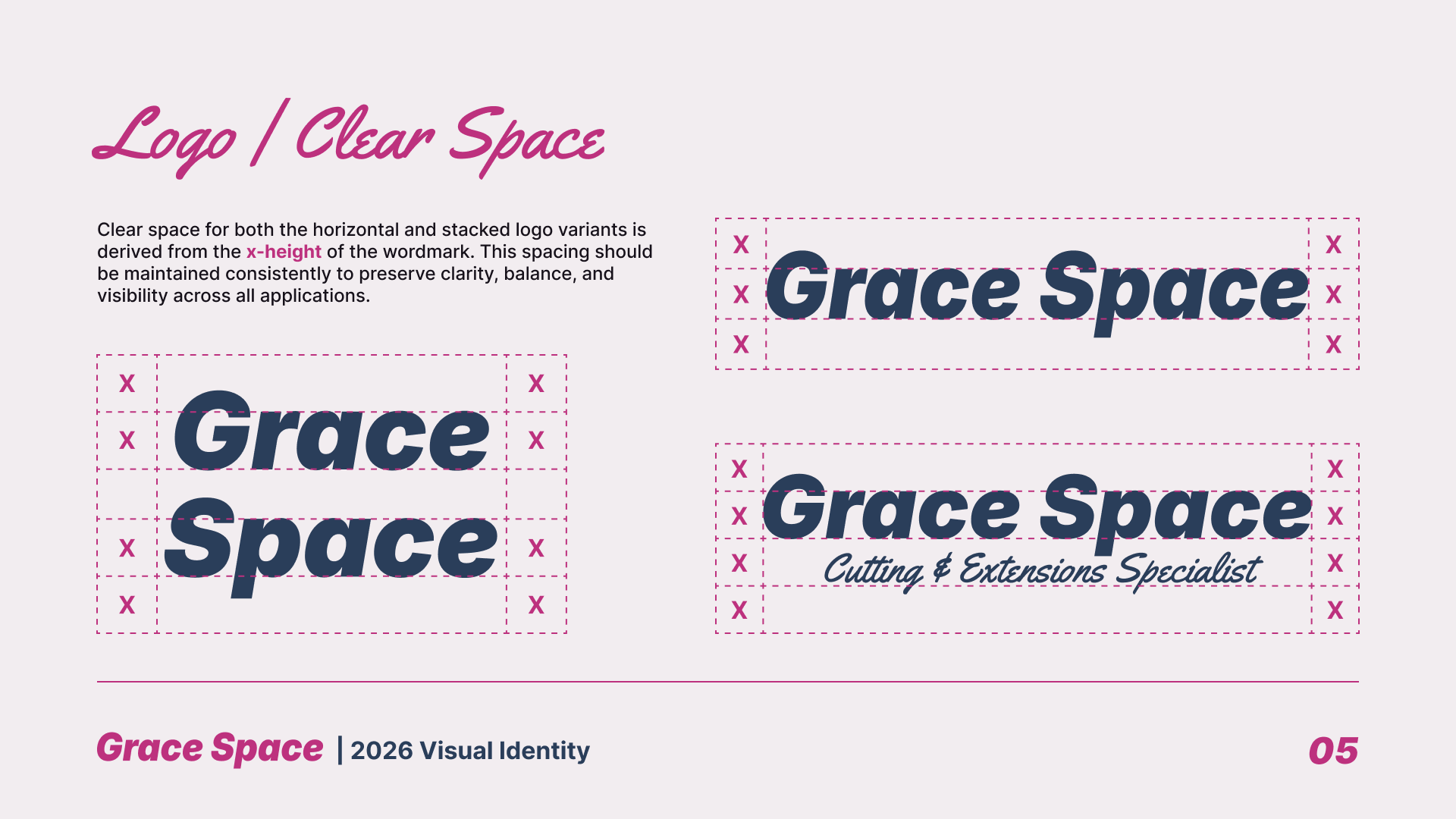
A full visual identity for Grace Space Hair, a Brighton-based hair stylist specialising in cutting and extensions, blending retro-futurist, space-inspired visual language with a refined editorial system.
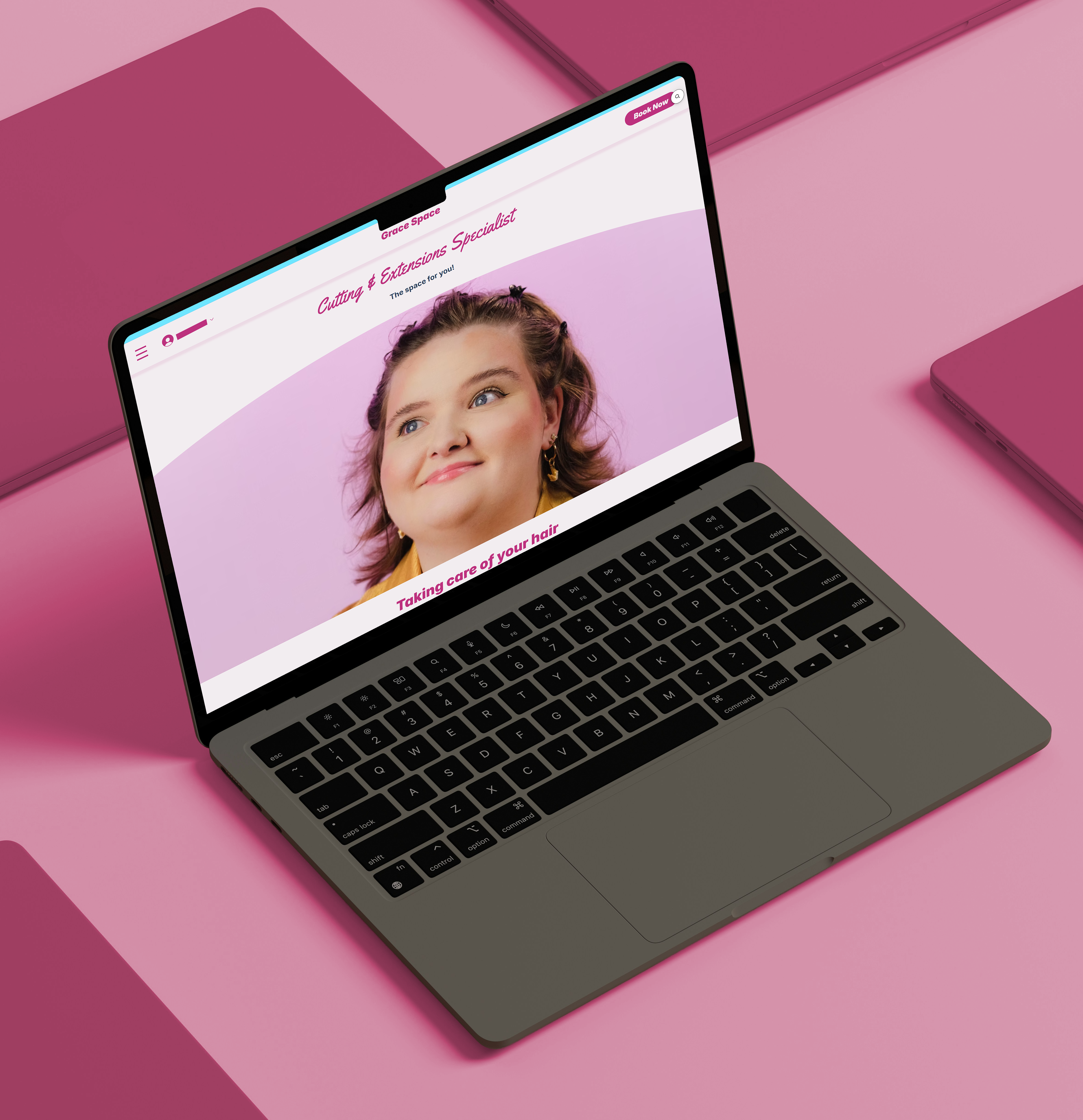
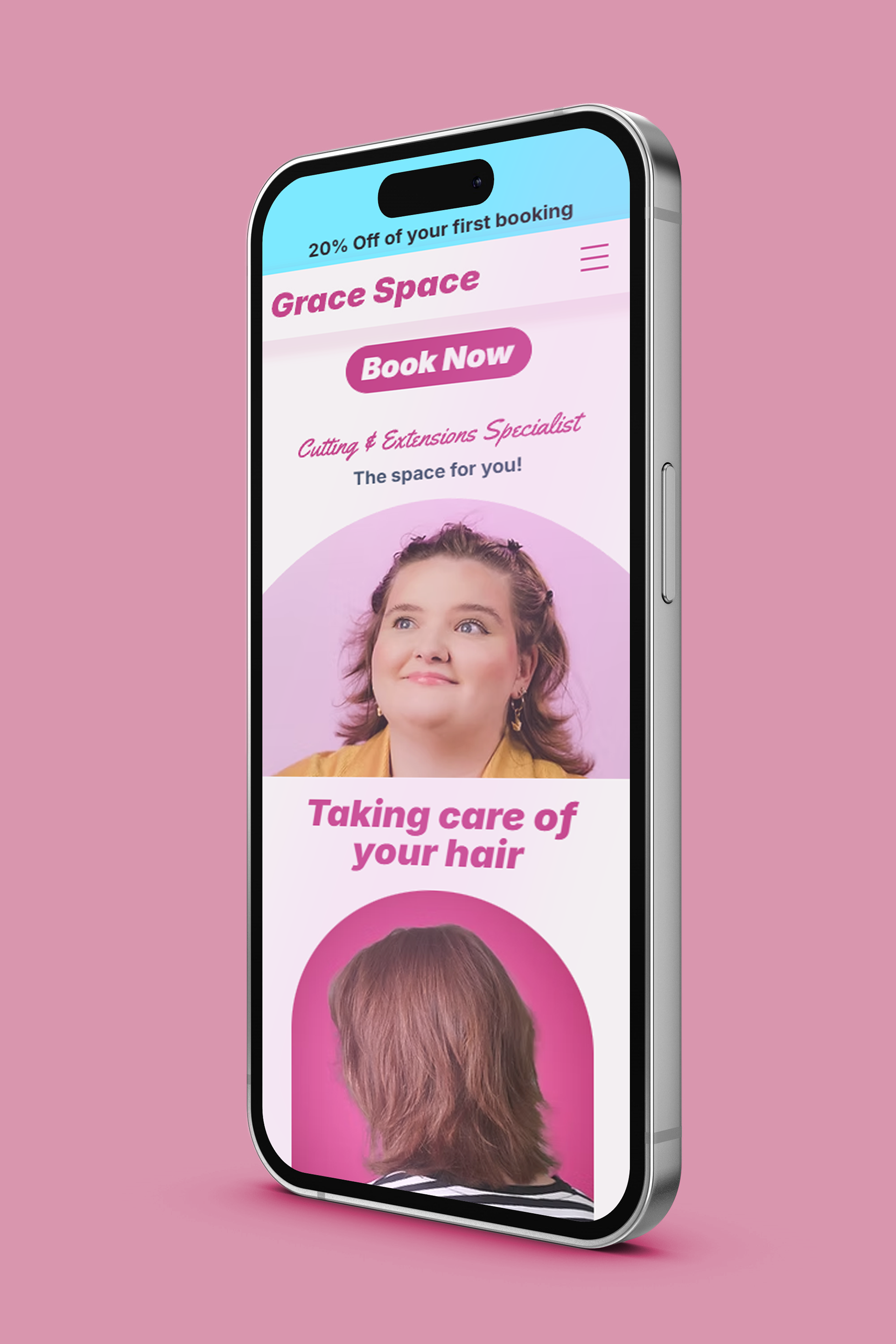
The scope covered brand identity, visual system + guidelines, website, and a 30-second brand sizzle film.
Concept
The brand's positioning centres on transformation. Cutting and extensions work is about renewal, change, and reinvention for the client sitting in the chair.
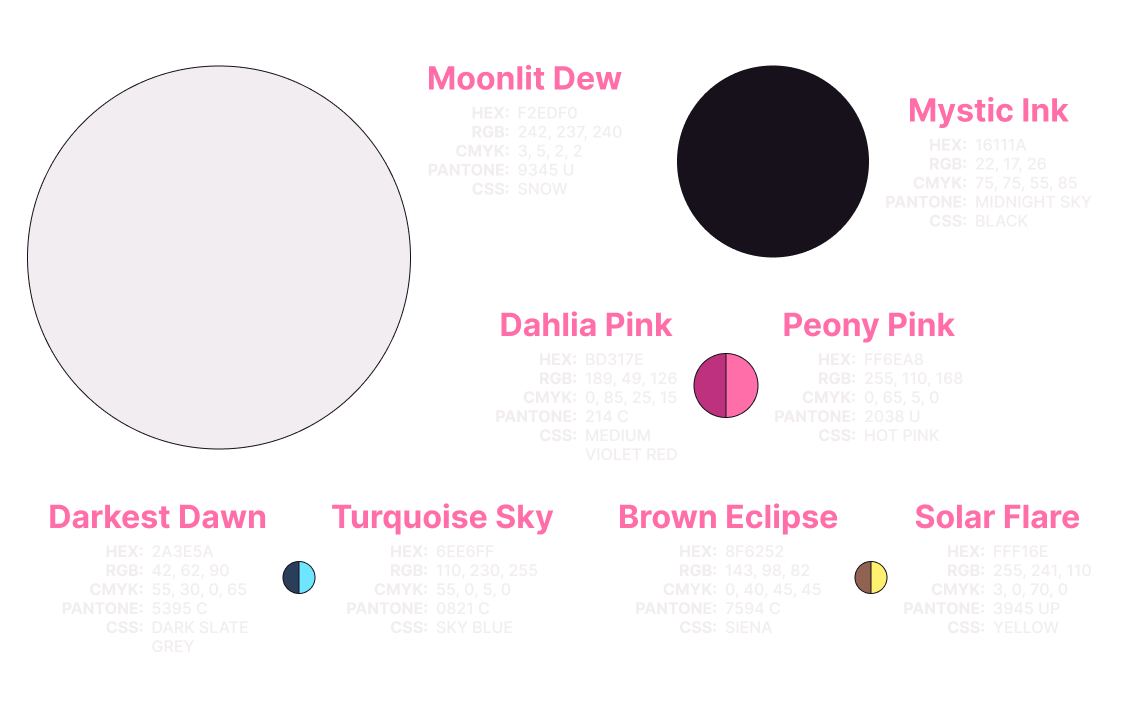
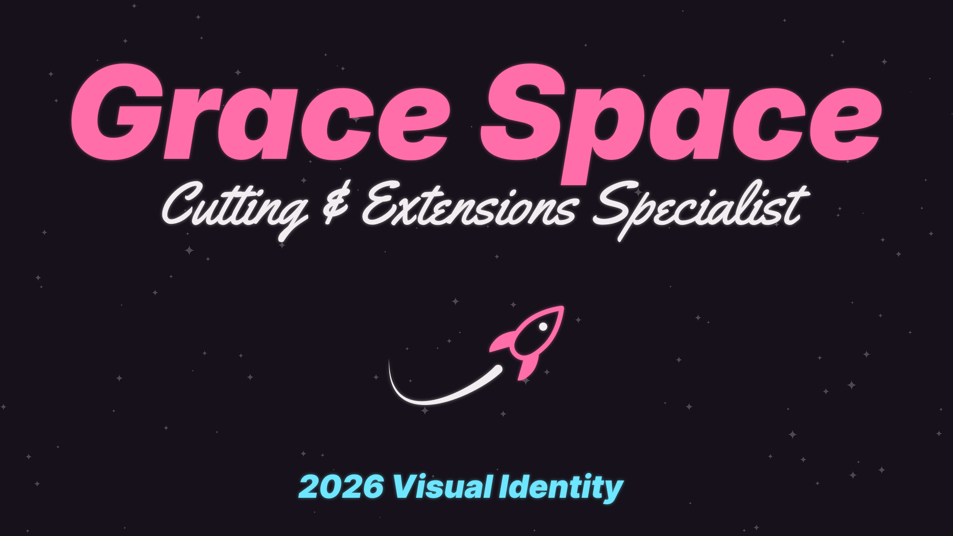
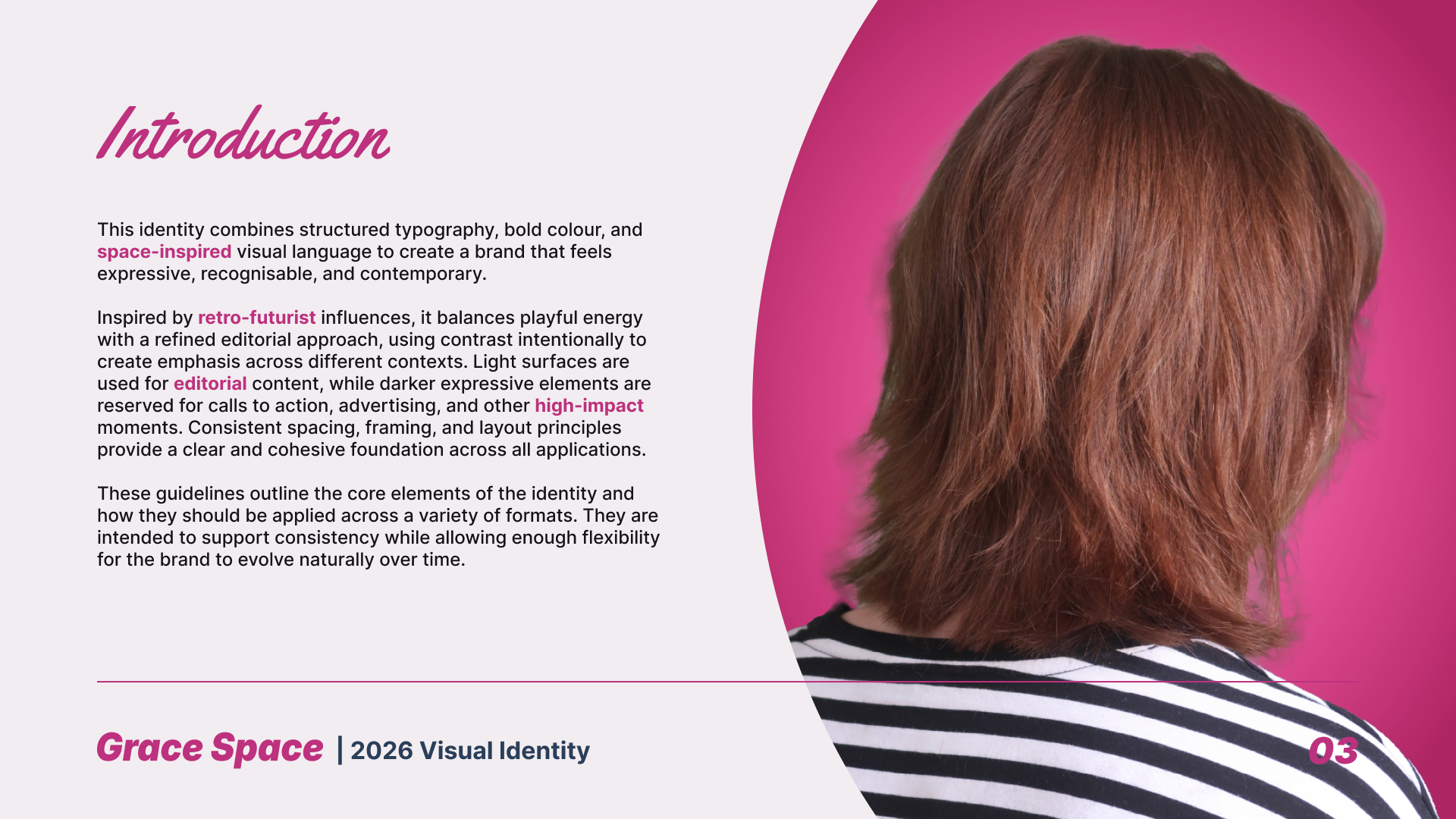
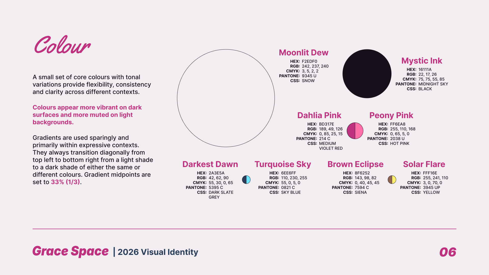
The name of the business lent itself naturally to a distinctive space aesthetic, immediately setting it apart from competitors with generic salon branding. Combined with the client's own aesthetic and colour preferences, this resulted in a retro-futurist direction that evokes Space Barbie.
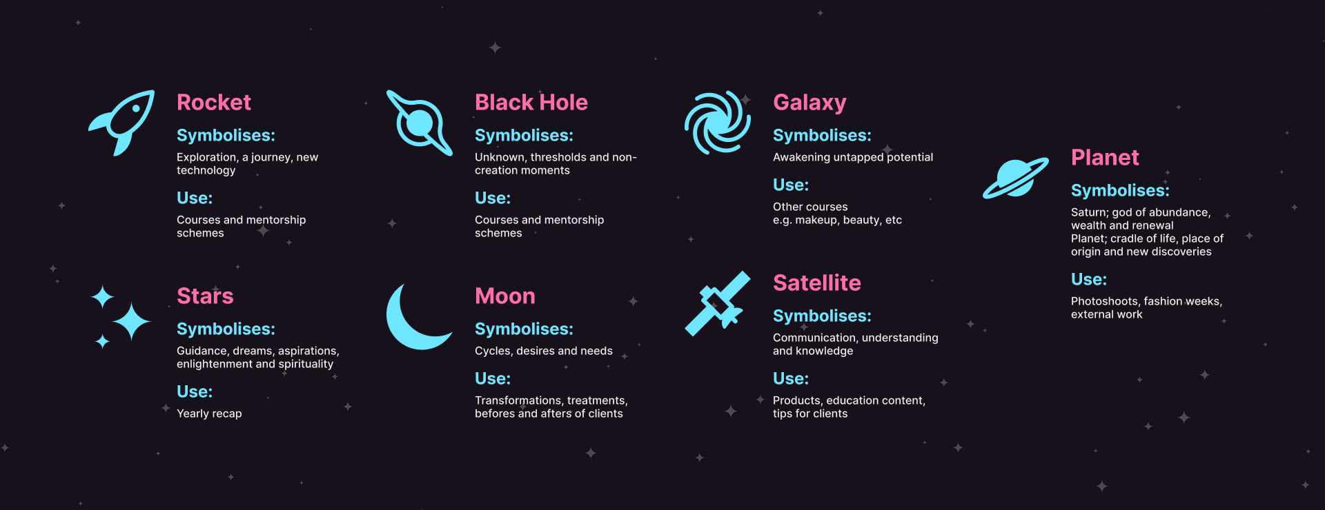
This theme carries through the entire visual system. Round shapes for imagery evoke planets and moons, while literal planet and moon icons represent renewal and exploration.
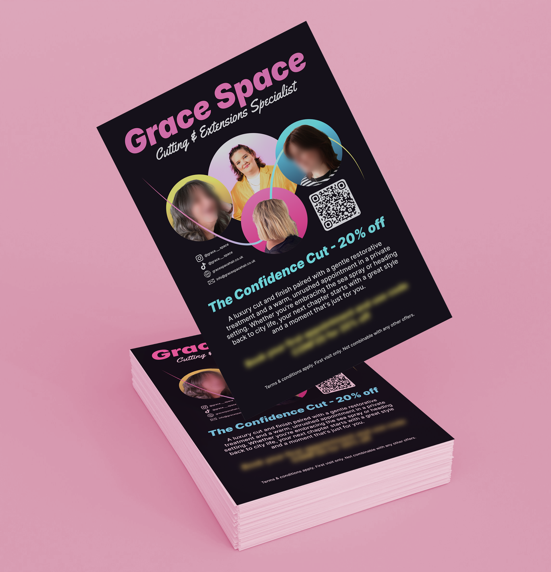
The inherent intensity of the retro-futurist elements lends itself well to expressive, high-impact and attention-grabbing contexts such as offers, calls to action, and other marketing materials. To balance this, a softer, more restrained editorial style was developed for day-to-day communications, keeping the identity from overwhelming customers while positioning the business firmly in the luxury hair space with a distinctive creative edge.
The resulting visual identity feels expressive and forward-looking, while staying grounded in a clear editorial system for everyday use.
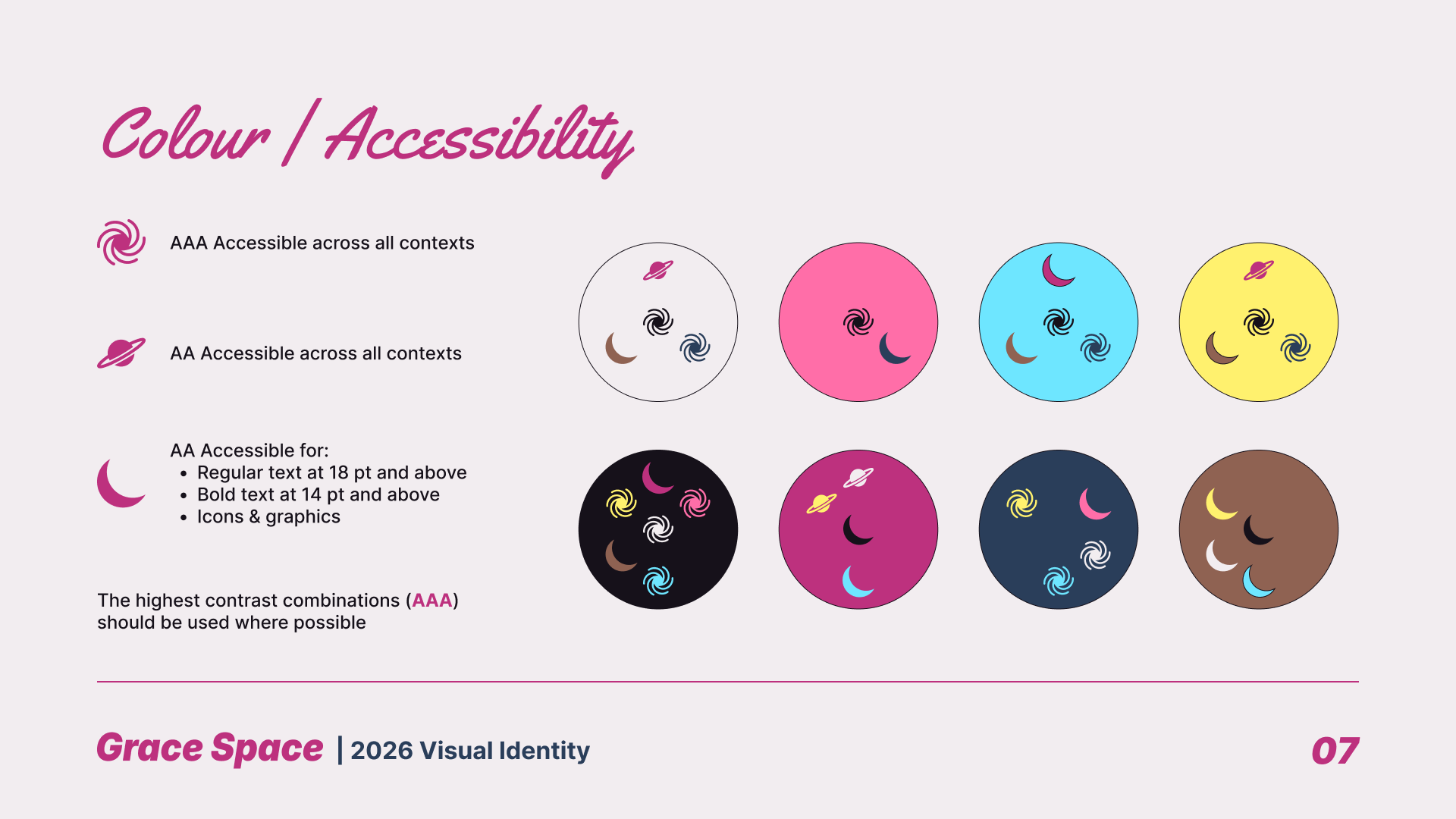
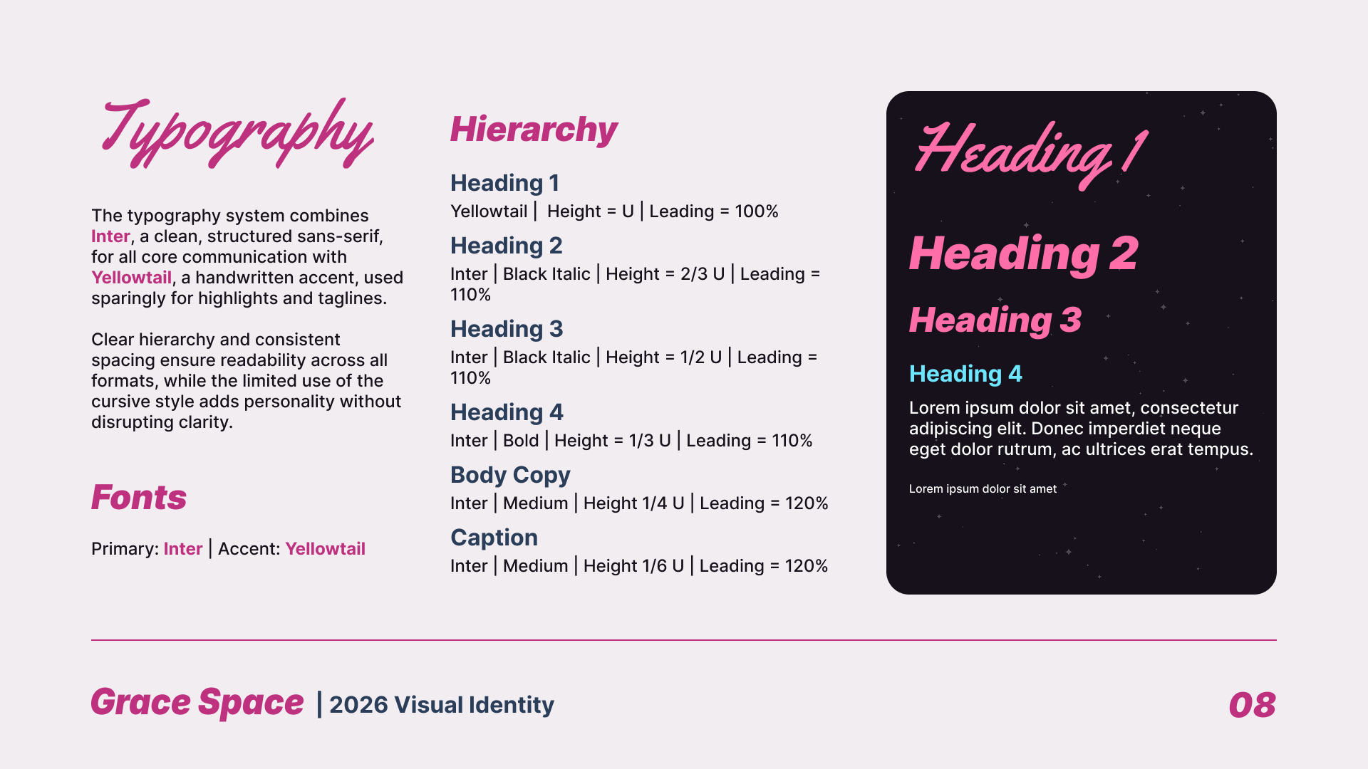

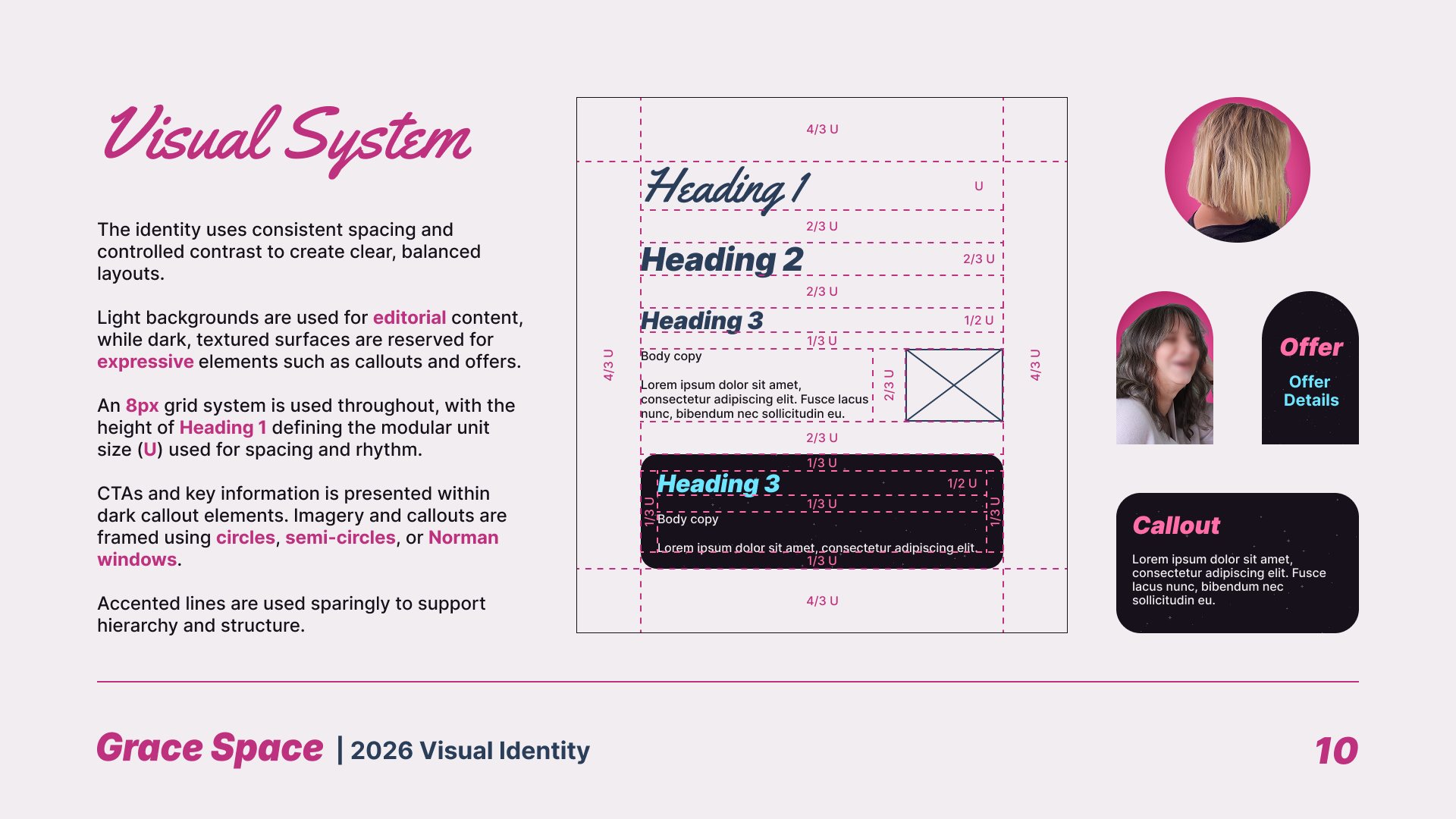
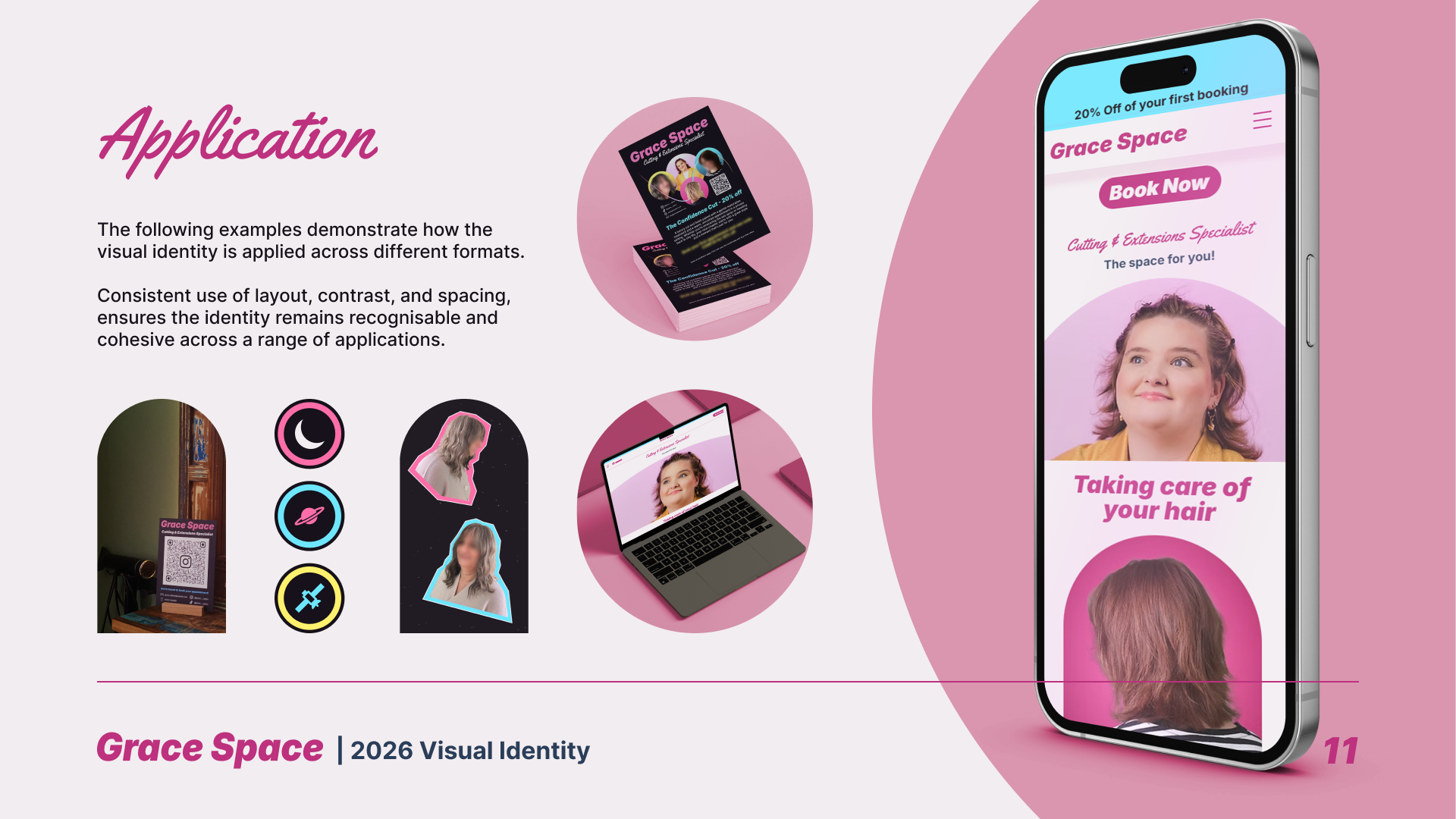

Brand elements shown are the property of Grace Space Hair. Reproduced here for portfolio purposes only